Overview
MimosaCare had the service. The website was not matching it.
MimosaCare is an Australia-based care service with disability support and accommodation offerings. The service was strong, but the website was not matching it.
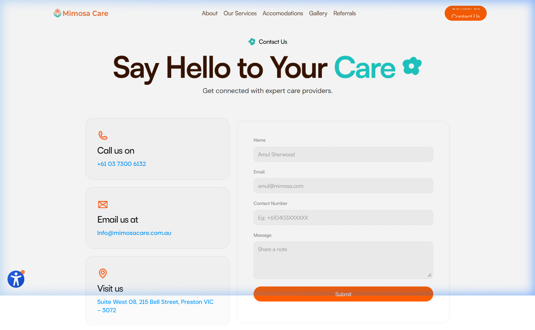
The site gave visitors information, but mixed service content, accommodation, contact paths, and operational links in a way that slowed trust down. People had to sort through the site before they could understand the offer.
The redesign closed the gap between what MimosaCare actually offers and what the website communicates — clearer messaging, calmer structure, and a build that holds the system together.
Outcome
The brand now reads more clearly.
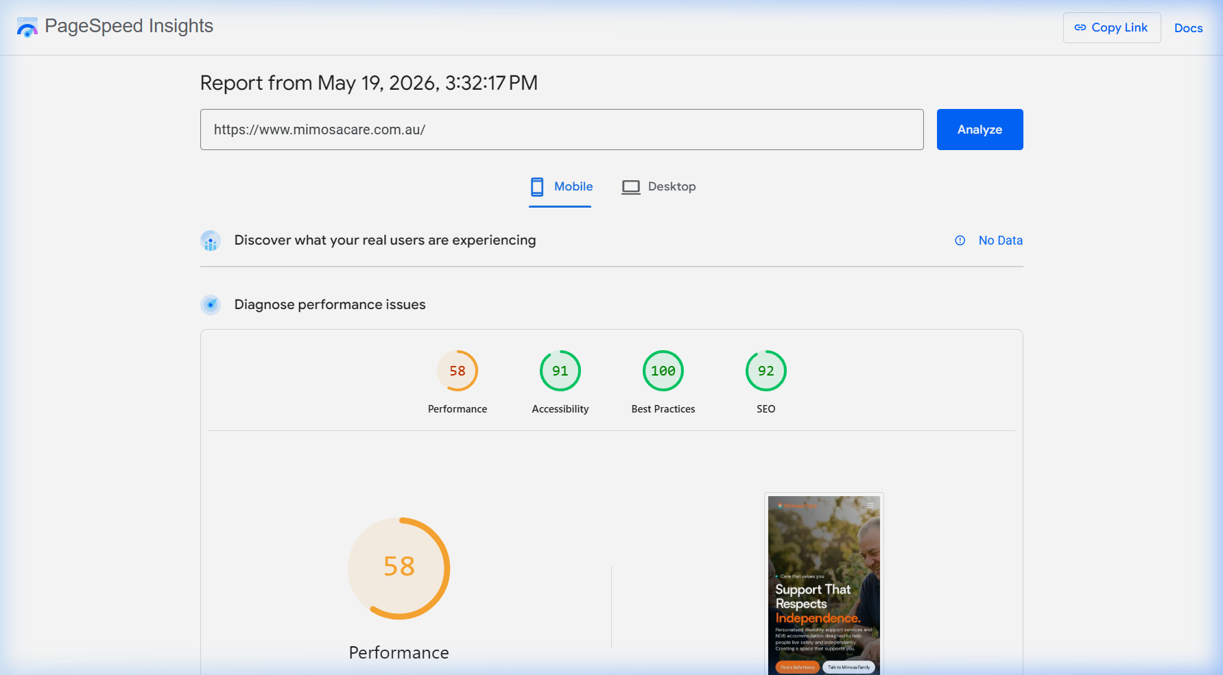
2 wk
End-to-end redesign timeline
1
Dab applied across the full site
8
Sections reframed for clarity
What was not landing
The site made people do too much work.
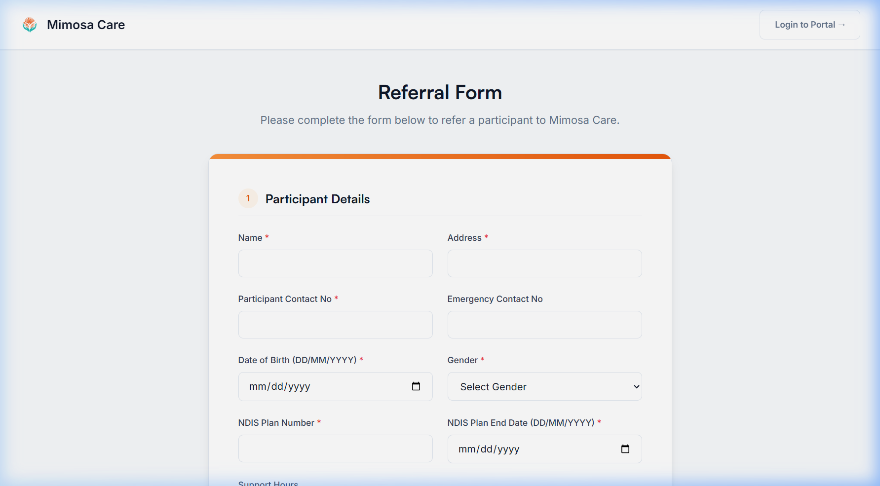
The old site gave people information but did not guide them. NDIS content, services, accommodation, referrals, careers, contact forms, and internal links all sat close together. Nothing was broken — it just made people do too much work before they could understand the offer.
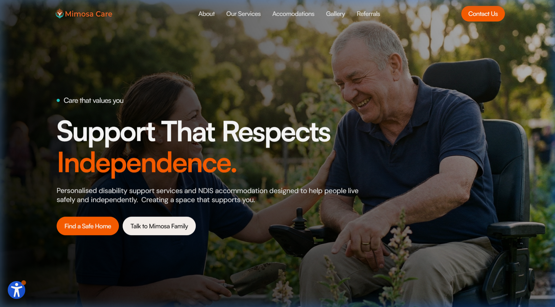
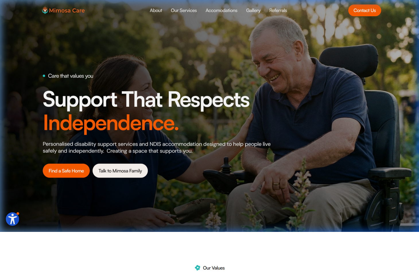
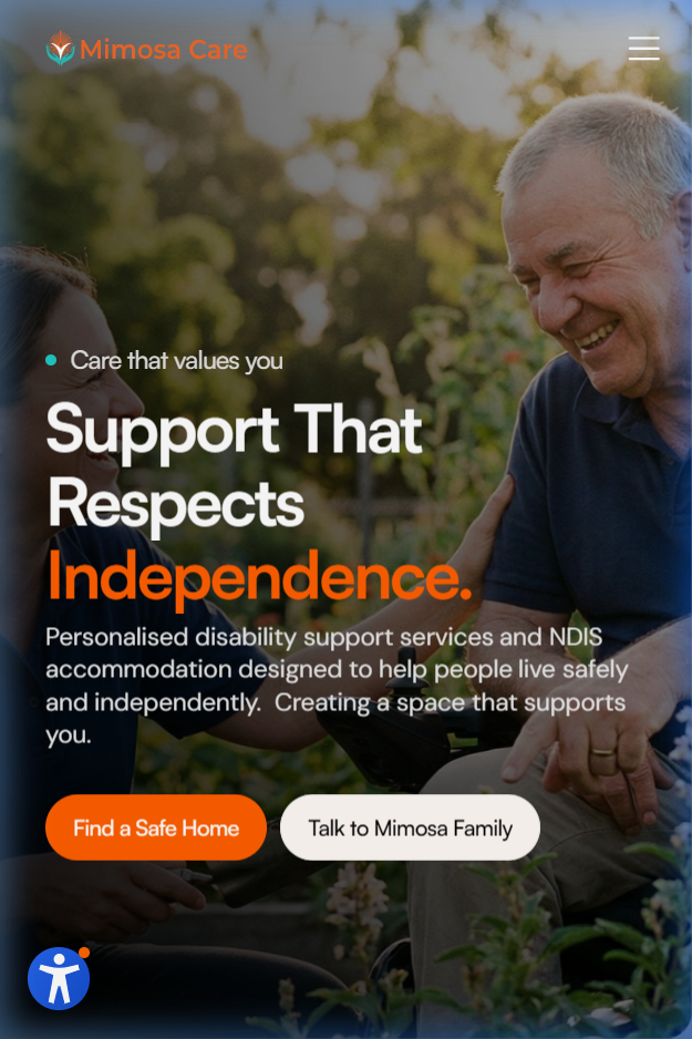
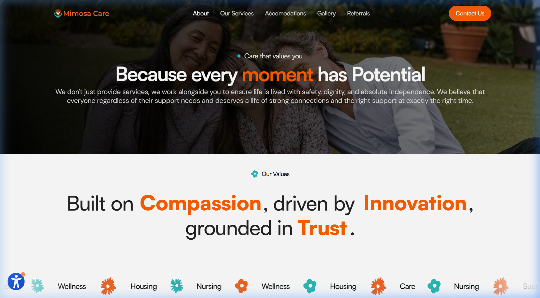
Reframed the homepage around independence so the first screen explains the brand faster.
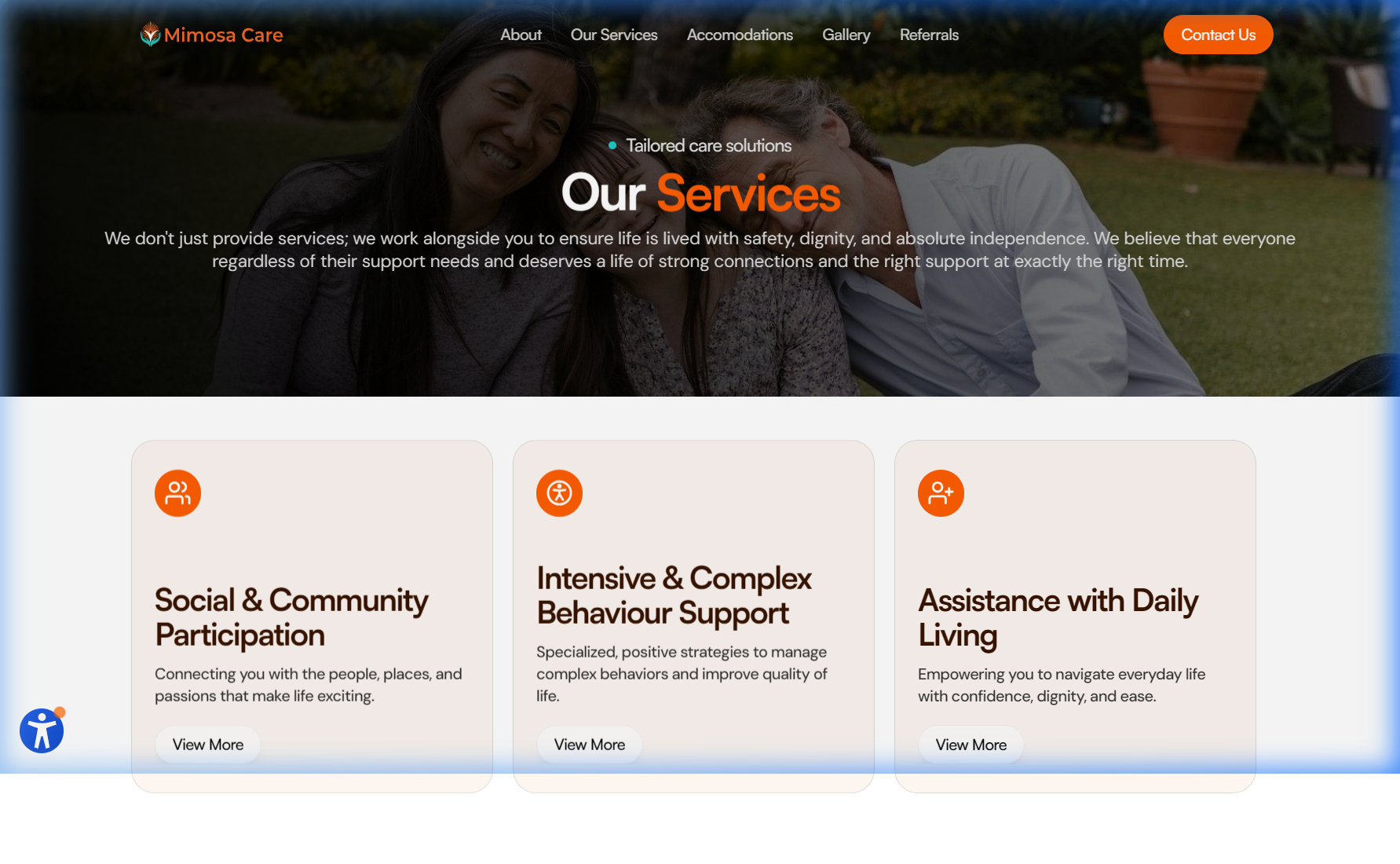
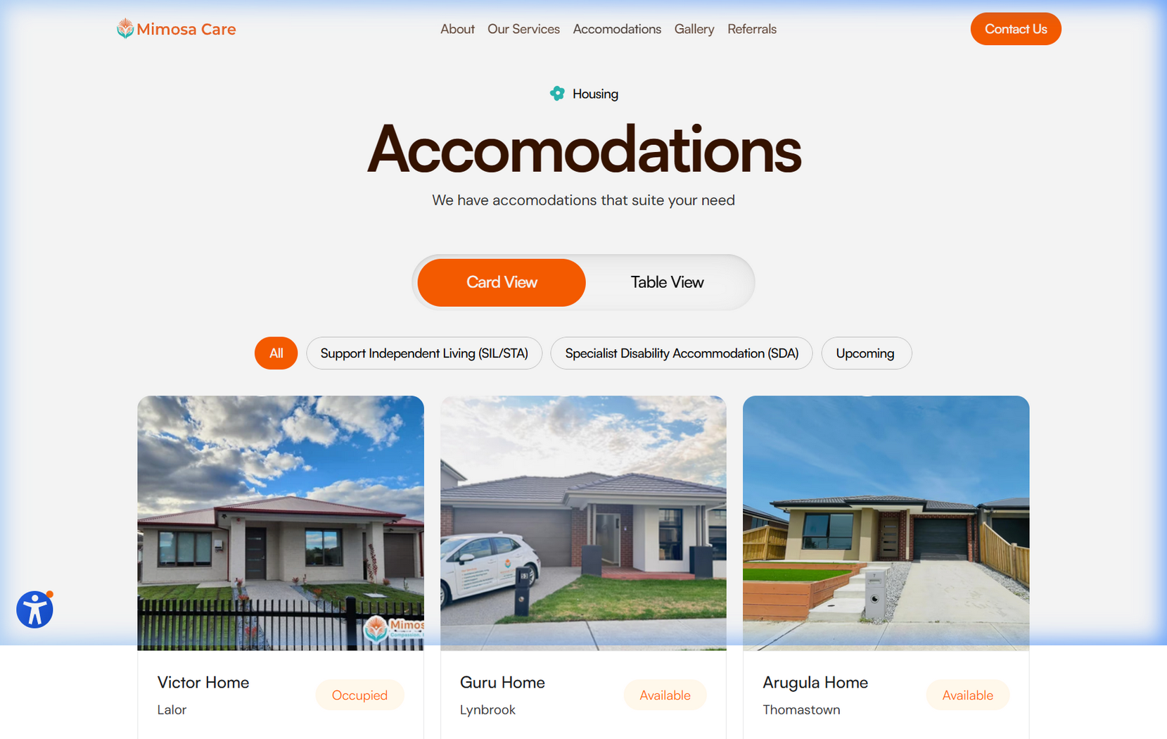
Reduced navigation to real choices and pulled accommodation closer to the start of the journey.
Rewrote messaging to sound direct and human — language that matches the care being offered.
Applying the dab
Each change had a clear job.
Reframed the homepage around independence so the first screen explains the brand faster.
Reduced navigation to real choices and pulled accommodation closer to the start of the journey.
Rewrote messaging to sound direct and human — language that matches the care being offered.
Used interaction as a quiet guide for attention, not decoration, so motion supports the content.
Aligned design and build across Framer (public site) and Laravel (structured workflows) so the final result stayed close to intent.
Selected screens
Clearer surfaces, fewer distractions.
Experience layer
Interaction was used to support the content.
Home entry
Calm first impression
The home enters with steady, quiet motion so visitors feel oriented before they read.
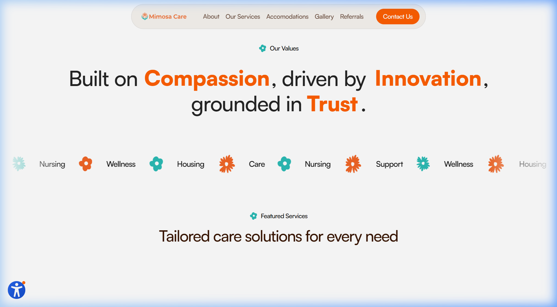
Navigation
Fewer real choices
Navigation collapses the old directory into the public paths people actually need.
Process
From a broad directory to a guided experience.
Audit
Not broken. Just not clear.
We mapped the old site as a broad service directory — NDIS, services, accommodation, referrals, operational links, all competing on the same surface. The issue was arrangement, not content.
Direction
Apply one dab across the whole site.
The two-week constraint forced focus. We did not redesign one section — we applied the same intentional change across messaging, structure, first impressions, interactions, and build.
Build
Hold the system together end-to-end.
Framer shaped the public experience quickly. Laravel handled the structured workflows. Design and build moved together so spacing, pacing, and hierarchy stayed intact.
Reflection
Sometimes, one dab is enough.
A strong service still needs a front door that matches it — clarity is a brand decision, not a polish pass.
Constraints help. Two weeks pushed every decision toward clarity and away from unnecessary extras.
One intentional change applied across the full site can do more than five isolated redesigns.
Interaction earns its place when it supports content. Quiet motion reads as care; loud motion reads as noise.
Next