
Overview
How a project hub lost its clutter and found its point.
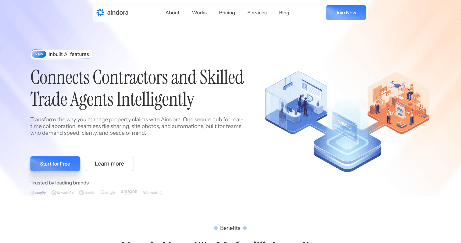
Aindora Flow is a project hub for contractors in Canada's property-claims world. Solo designer, working with a senior developer. Client in Canada. Me in Kathmandu.
The old dashboard counted 17 clickable decisions before anyone had done any work. Five tools, five colors, every card shouting at the same volume.
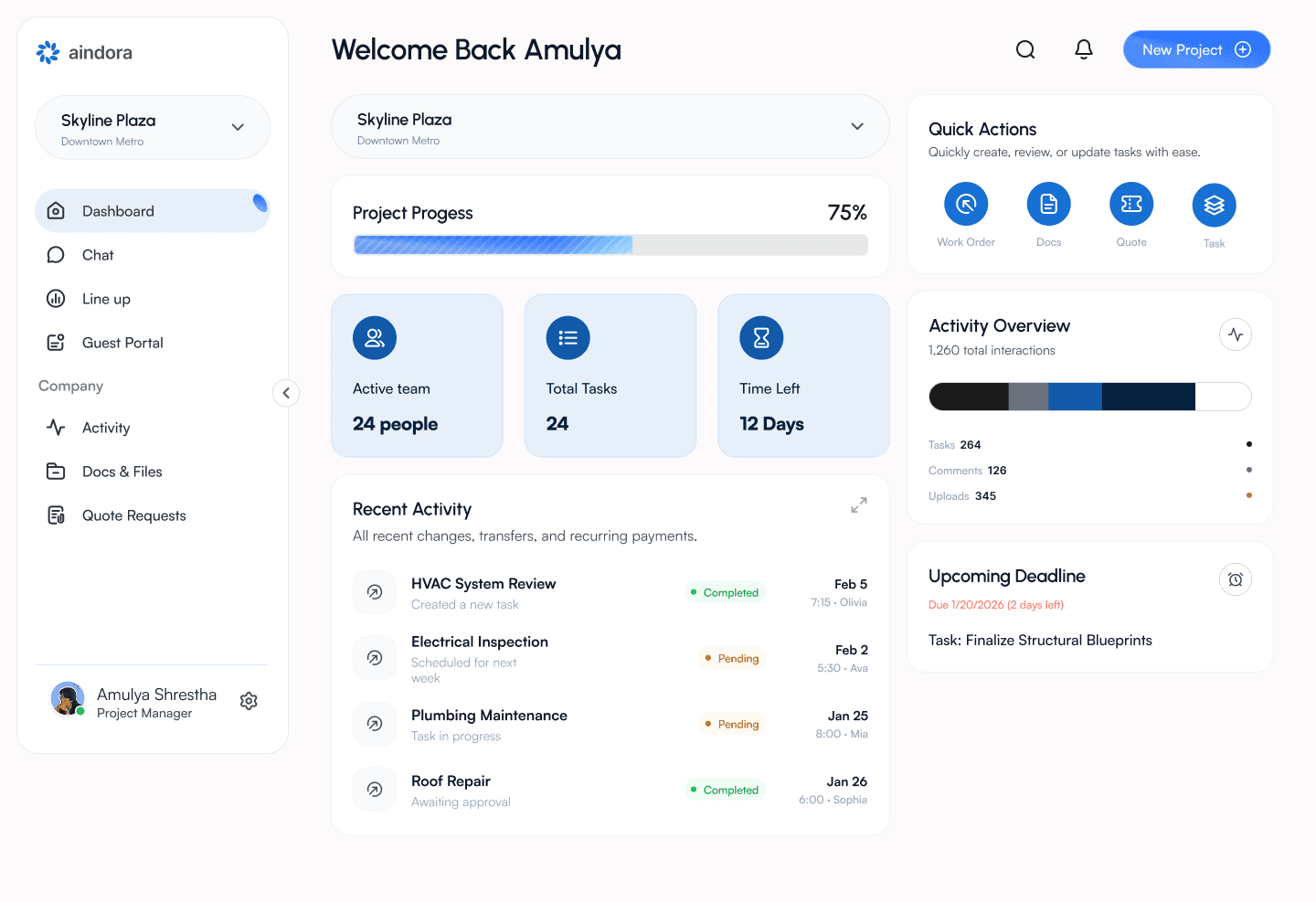
The redesign cut that to one primary decision: where is my project, what's late, what's next. Status first. Tools second.
Outcome
Fewer clicks, calmer humans.
17 → 1
Primary decisions on the dashboard
6 → 2
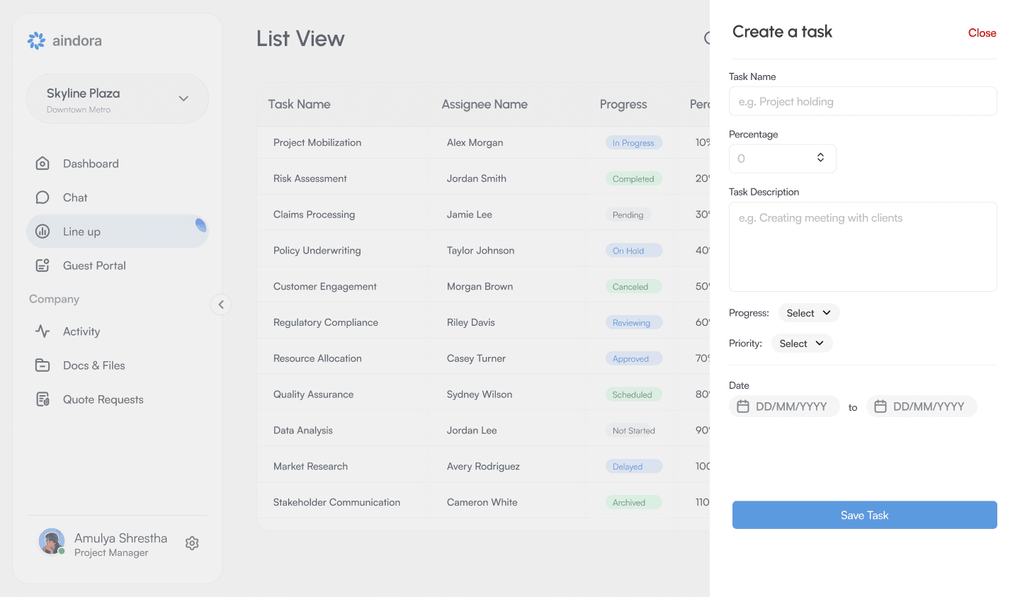
Clicks to create a task (est.)
100%
Screens that answer “what’s my status?”
The count
The product asked users to think about the product.
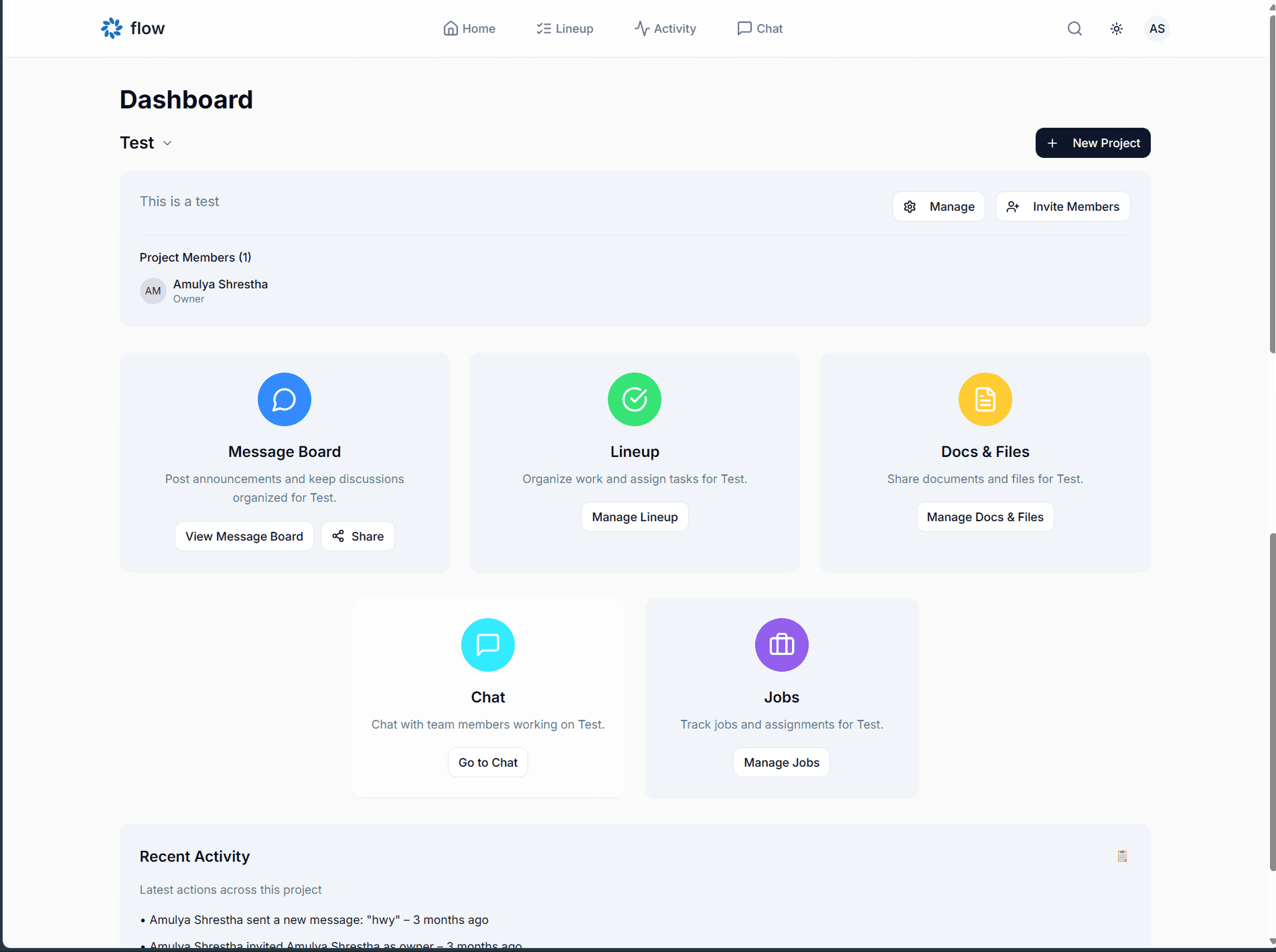
The original dashboard asked users to think about the product. Seventeen clickable decisions sat on the first screen: seven nav items, three project actions, seven tool buttons. They needed to think about claims, crews, and deadlines. That gap is where users leave.
01
Counted every choice on the first screen and cut the ones that were about the product, not the job.
02
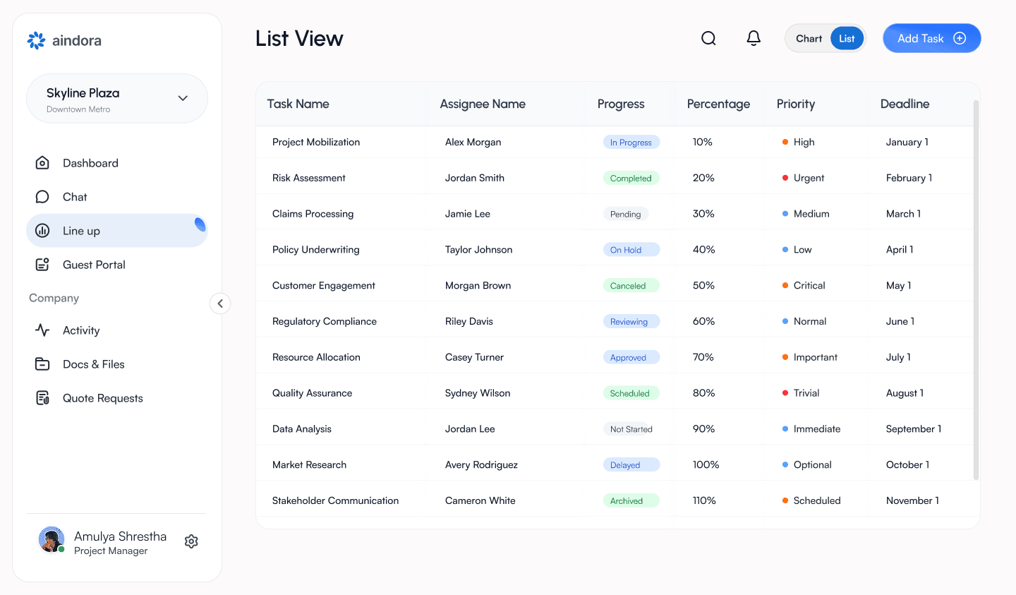
Replaced rainbow tool cards with a single status-led dashboard.
03
Gave empty states a next action so new users were not greeted with a shrug.
Design strategy
Stop showing tools. Start showing status.
Counted every choice on the first screen and cut the ones that were about the product, not the job.
Replaced rainbow tool cards with a single status-led dashboard.
Gave empty states a next action so new users were not greeted with a shrug.
Selected screens
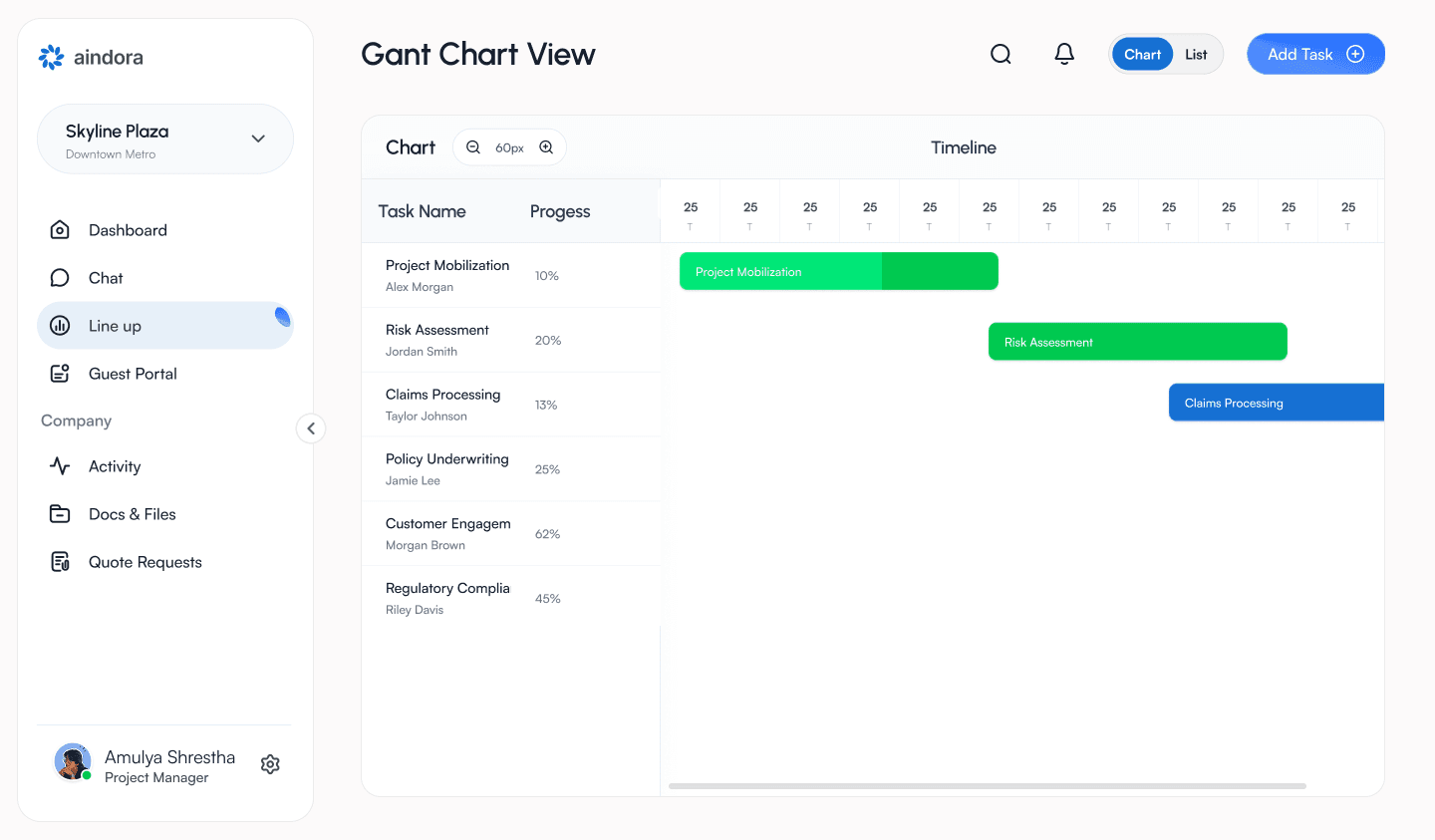
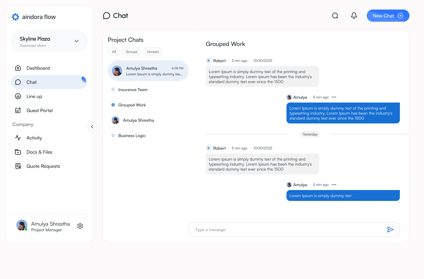
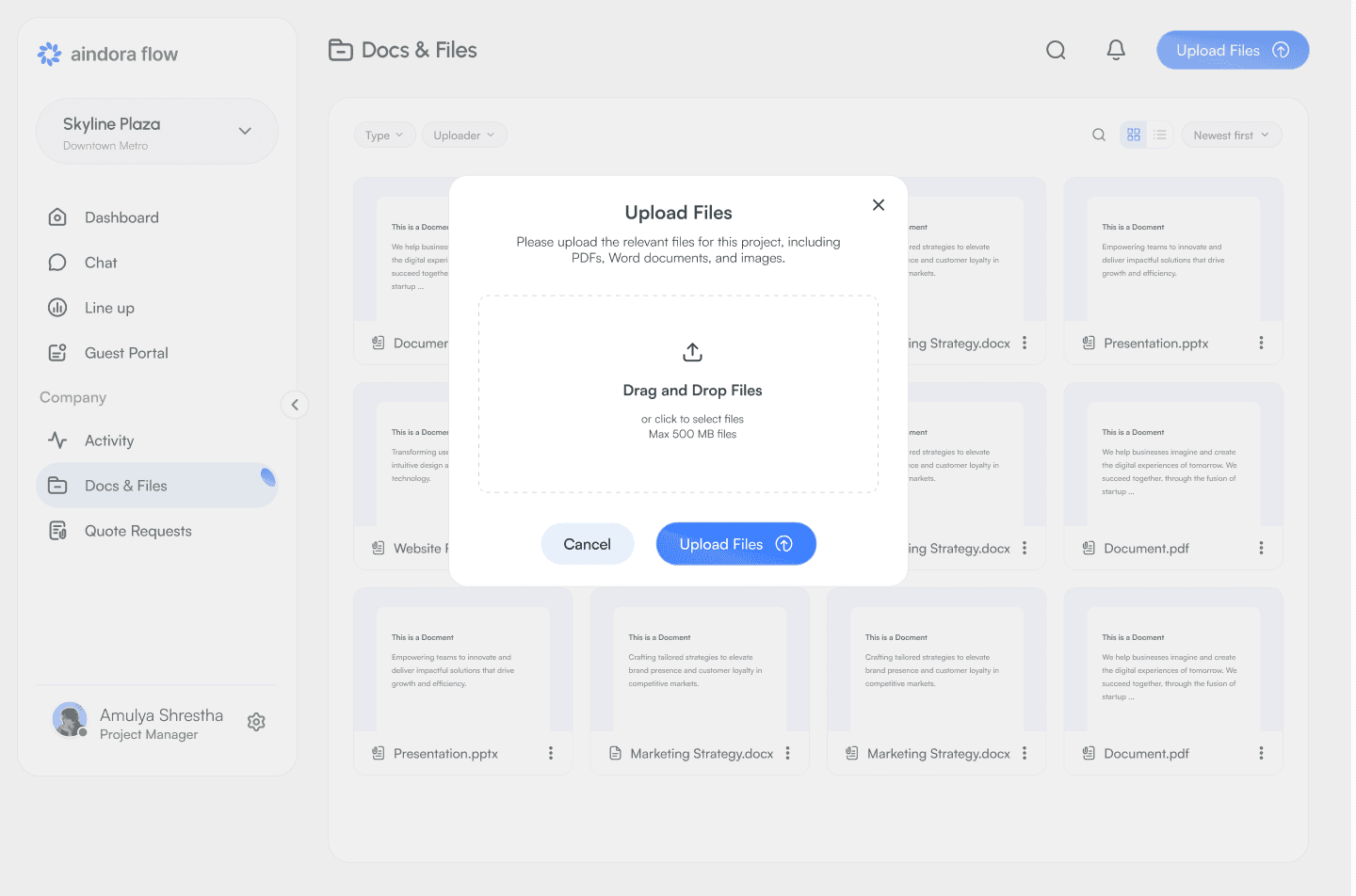
One system, every screen.
Process
Twice a week, across 11 time zones.
Audit
Seventeen decisions, no work done.
Hick's Law on the first screen: more options, slower humans. We mapped every clickable thing before touching layout.
Principle
Stop showing tools. Start showing status.
A project manager at 8 AM does not need a message board. They need where the project is, what is late, and what is next.
Cadence
9:30 PM, Kathmandu. Twice a week.
Me, a senior developer, and the client: sketching, arguing, cutting scope across 11 time zones. Solo designer does not mean designing alone.
Takeaways
What the quieter hub reinforced.
A dashboard that shows tools asks people to assemble a product. A dashboard that shows status lets them do the job.
Color is a job. When every icon is highlighted, nothing is remembered.
Empty states are the first conversation with a new user. A shrug is not a conversation.
Remote, late-night collaboration still works when the meetings are about cutting, not decorating.
Next case study