
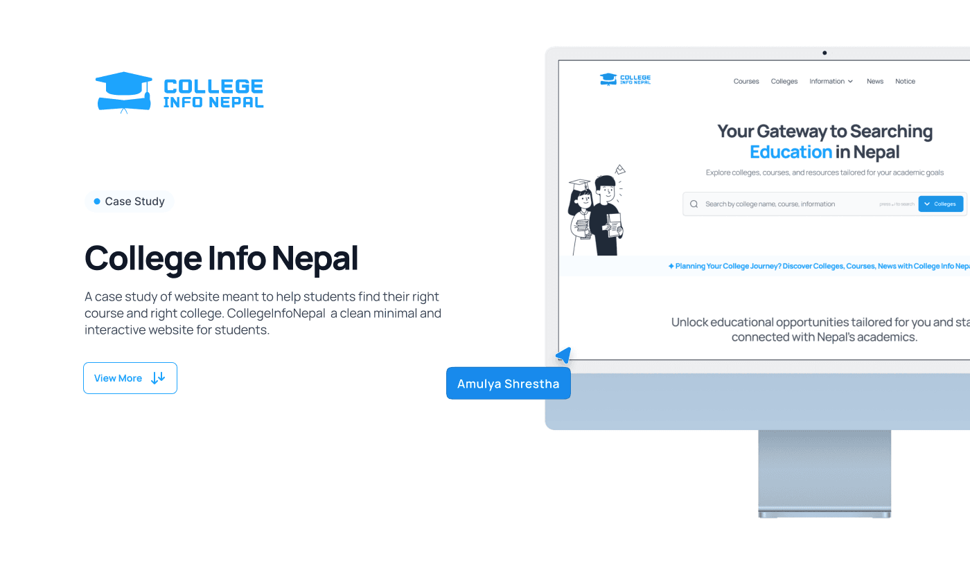
Overview
A college directory that started answering the real question.
College Info Nepal is a household name for Nepali students. Outdated look, confusing navigation, and a mobile experience nobody defended in meetings.
Above the fold: an exam-news headline. Nothing on that screen said “find a college.” Search was a sidebar. Colleges lived behind a dropdown.
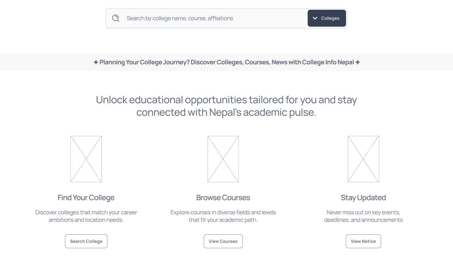
The redesign led with search and let the news follow. Three jobs on the homepage: find your college, browse courses, stay updated.
Outcome
The directory finally opens with search.
3
Jobs on the homepage
1,125
Colleges one search away
0
News posts standing between a student and a college
What was not landing
The site answered yesterday's news.
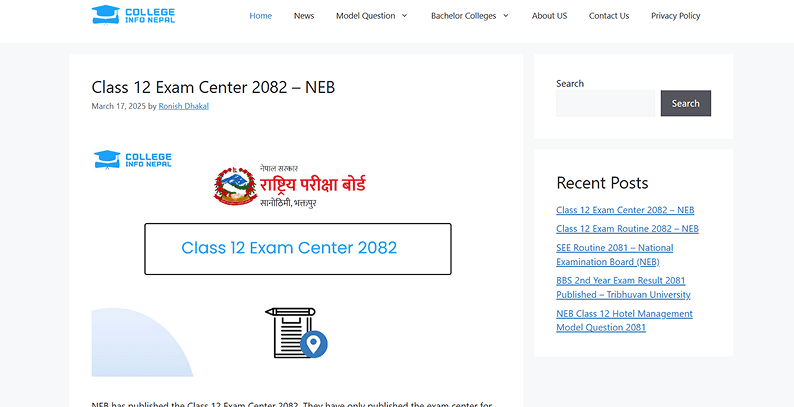
A college directory whose homepage was a blog post about exam centers. Search, the number-one job, lived in a sidebar widget. Colleges sat behind a nav dropdown. Students arrived to pick a future and left knowing this month's exam routine instead.
01
Moved search from a sidebar widget to the front door of the product.
02
Gave the homepage exactly three jobs: find a college, browse courses, stay updated.
03
Settled the structure in grayscale first so style could not rescue a wrong spine.
Design strategy
Lead with search. Let the news follow.
Moved search from a sidebar widget to the front door of the product.
Gave the homepage exactly three jobs: find a college, browse courses, stay updated.
Settled the structure in grayscale first so style could not rescue a wrong spine.
Selected screens
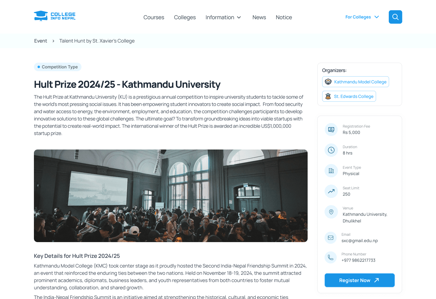
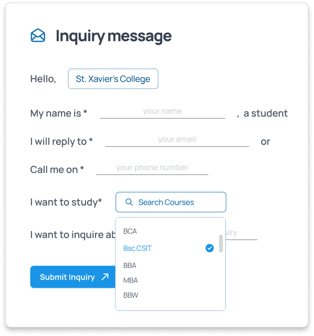
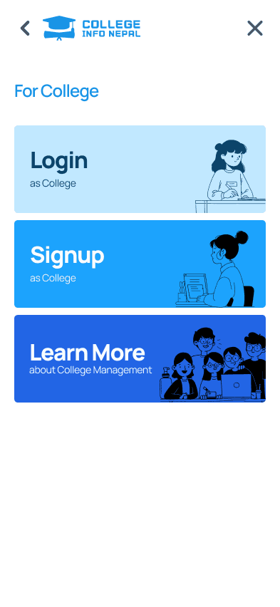
One system, every screen.

Process
From blog-first portal to search-first product.
Diagnosis
A directory that opened like a newspaper.
Jakob's Law: people expect a directory to open with search, not posts. We wrote the diagnosis on the wall — outdated design, confusing CTAs, difficult navigation.
Structure
If it works ugly, it will fly pretty.
The wireframe puts one search bar on top and the three jobs directly under it. Style never rescued a wrong structure, so the structure was settled in grayscale.
Front door
Lead with search. Let the news follow.
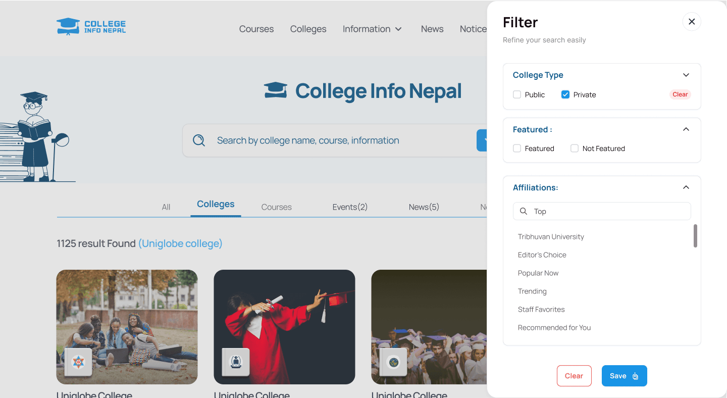
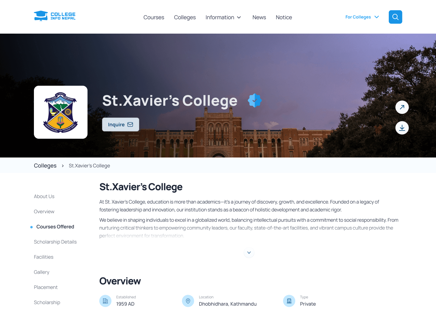
Same skeleton, new skin. Search, filters, college profiles, and events now sit on the path a Grade-12 student actually walks.
Takeaways
What the search-led spine reinforced.
A college site that leads with news asks students to wait. A college site that leads with search lets them decide.
Three jobs is enough for a homepage. Everything else can follow.
Wireframes protect you from decorating a wrong structure.
Household-name traffic is not the same thing as a working product.
Next case study